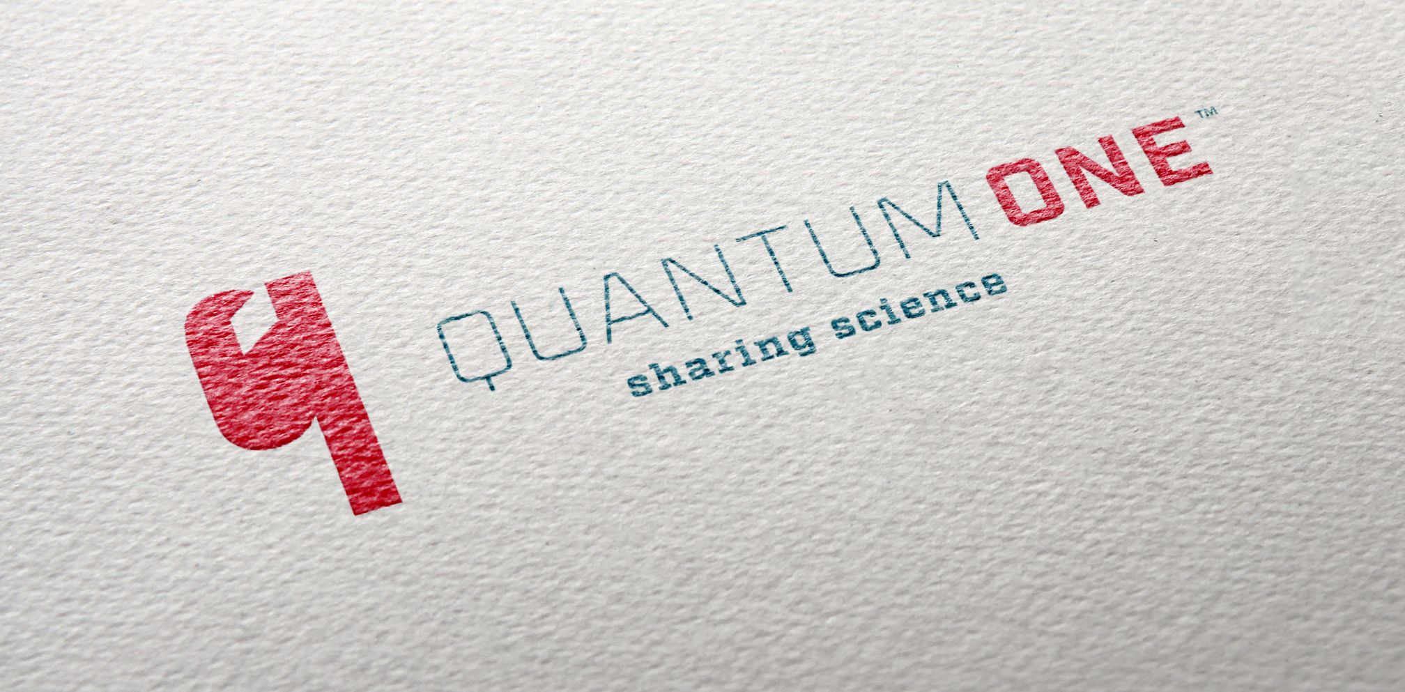
Quantum One Branding
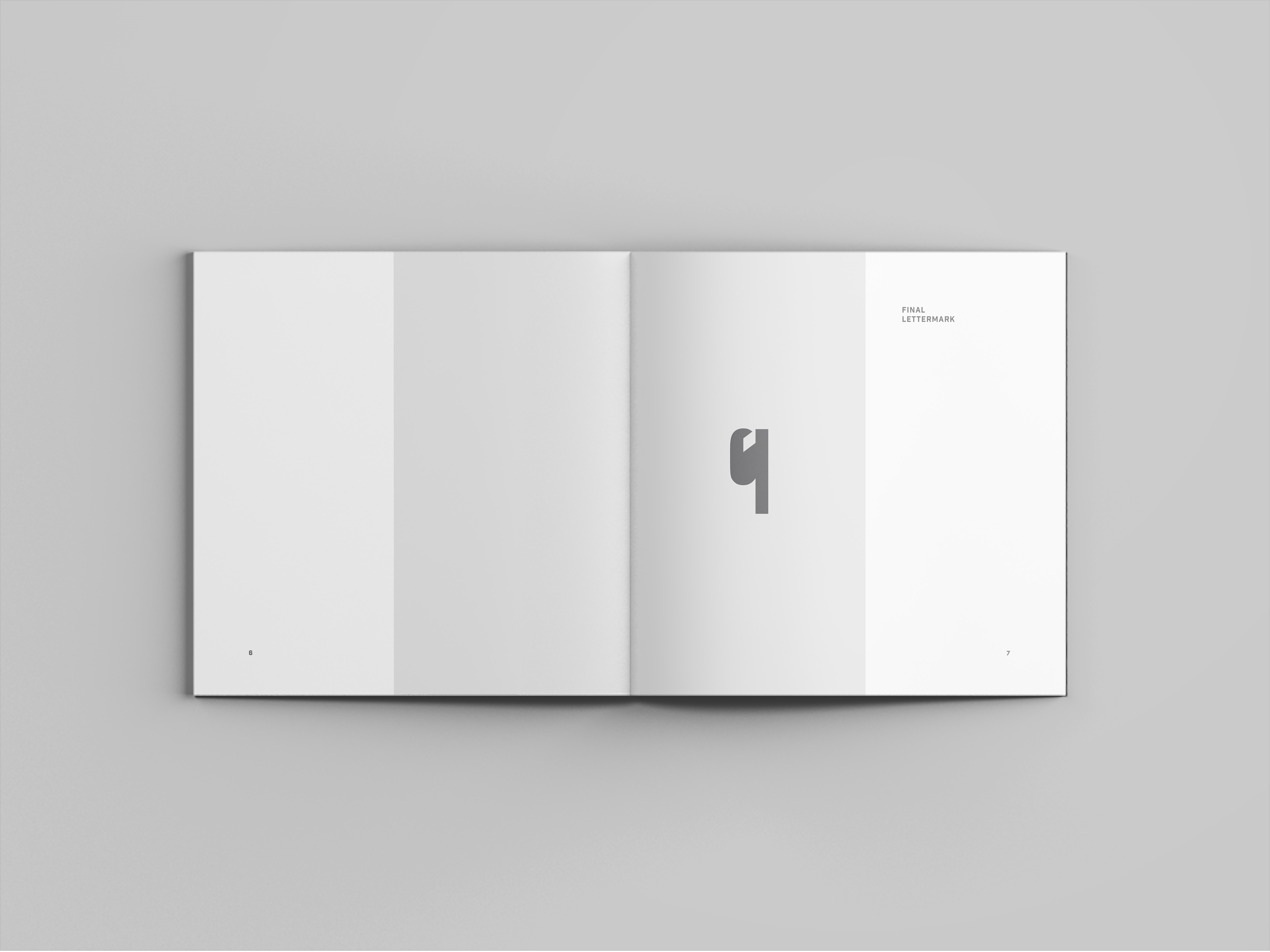
After choosing three characters at random, a logo was developed that combined two of them. Because the chosen logo evoked a personality similar to many scientific research companies, it was expanded into a conceptual brand for a scientific research company that thrives on collaboration. This process involved quite a bit of research into the chosen industry to see how similar companies approached their visual identities. To catalog all the information provided, the research and design process was then made into a book.
Tools: Sketchbook, Adobe Illustrator, Adobe Photoshop, Adobe InDesign.
Sketches
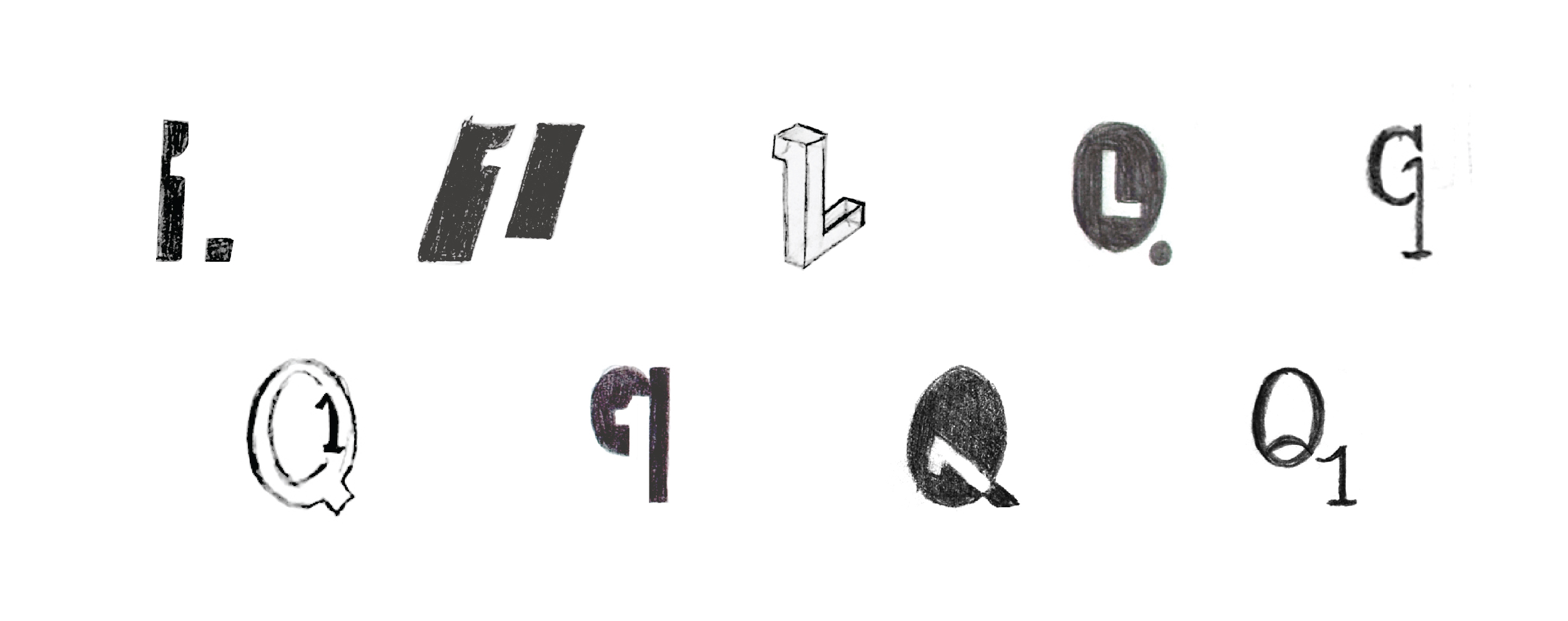
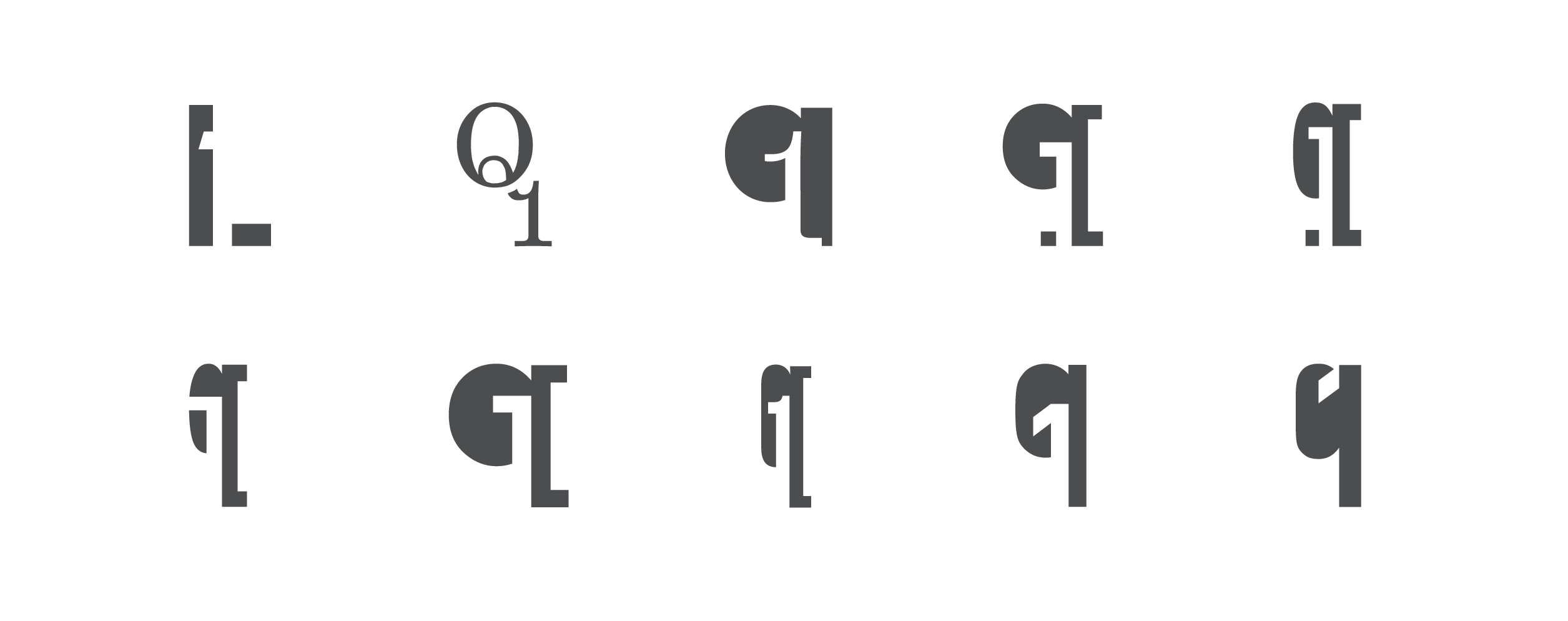
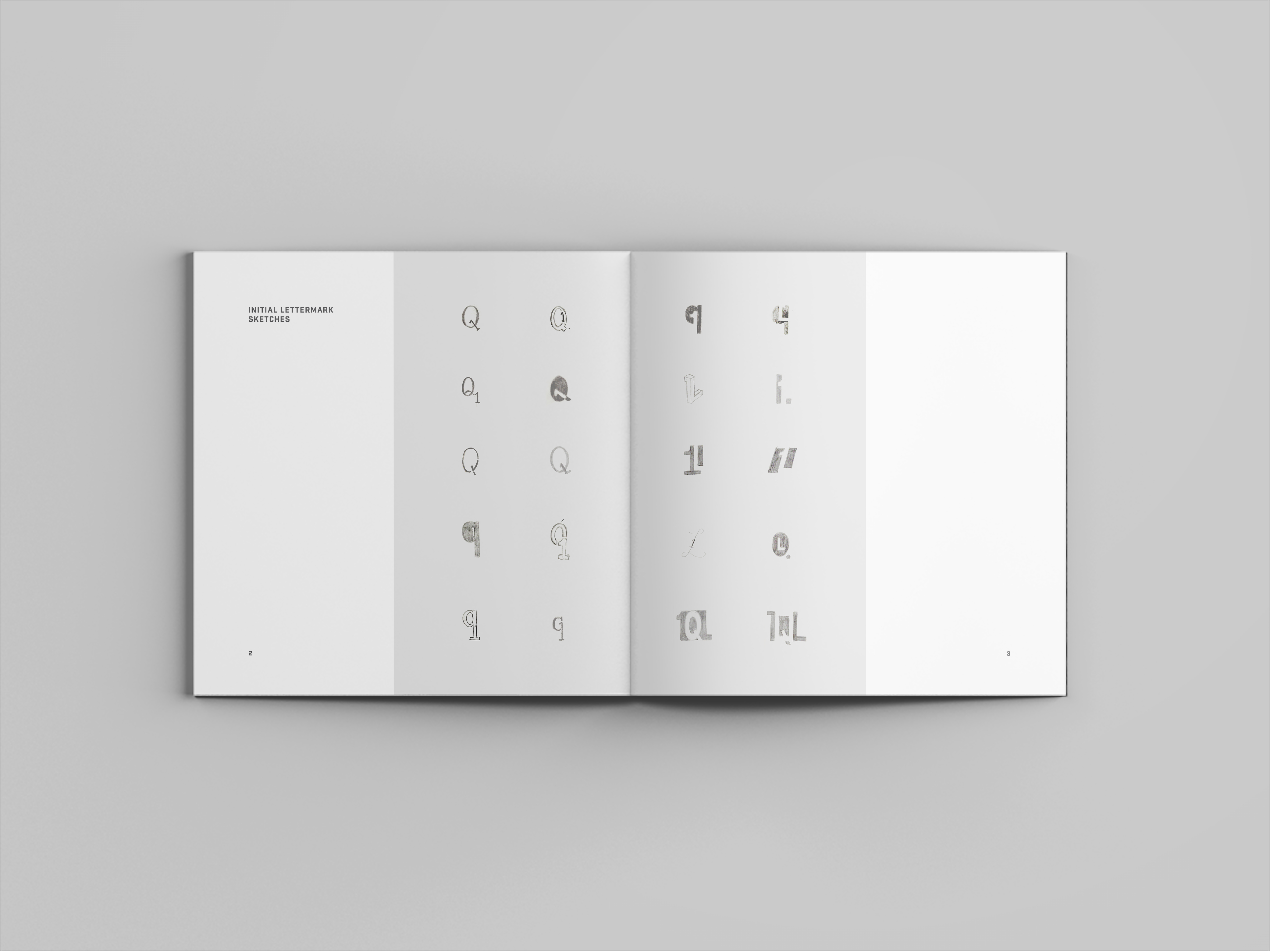
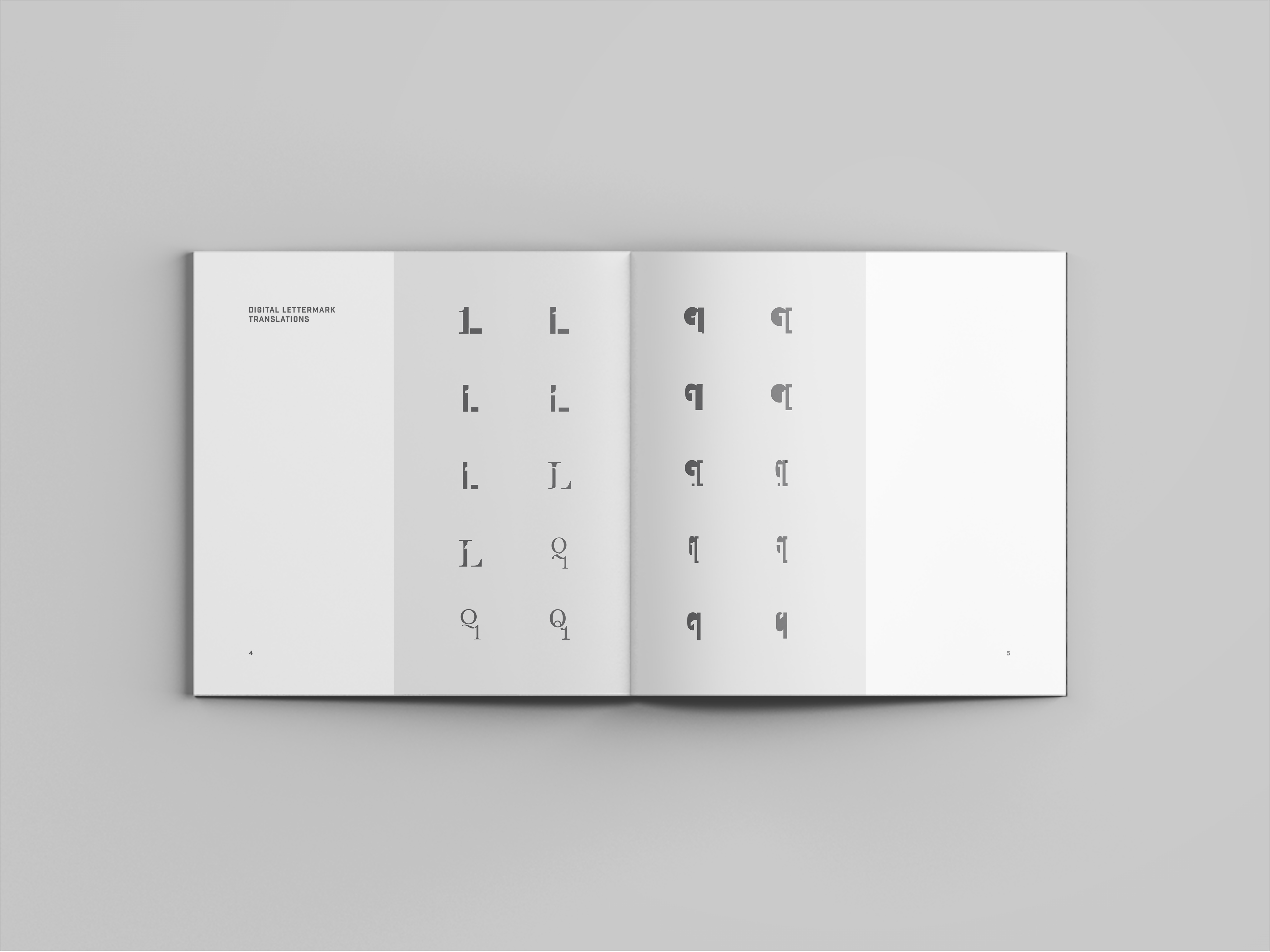
After drawing the characters 'l', 'q', and '1' at random from a hat, different combinations of two of the characters were sketched before finding compelling solutions. All Contenders were then drawn digitally, where more discoveries were made.
After drawing the characters 'l', 'q', and '1' at random from a hat, different combinations of two of the characters were sketched before finding compelling solutions. All Contenders were then drawn digitally, where more discoveries were made.
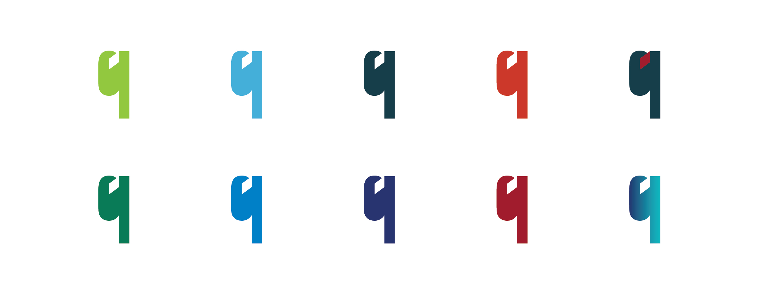
Signature Development
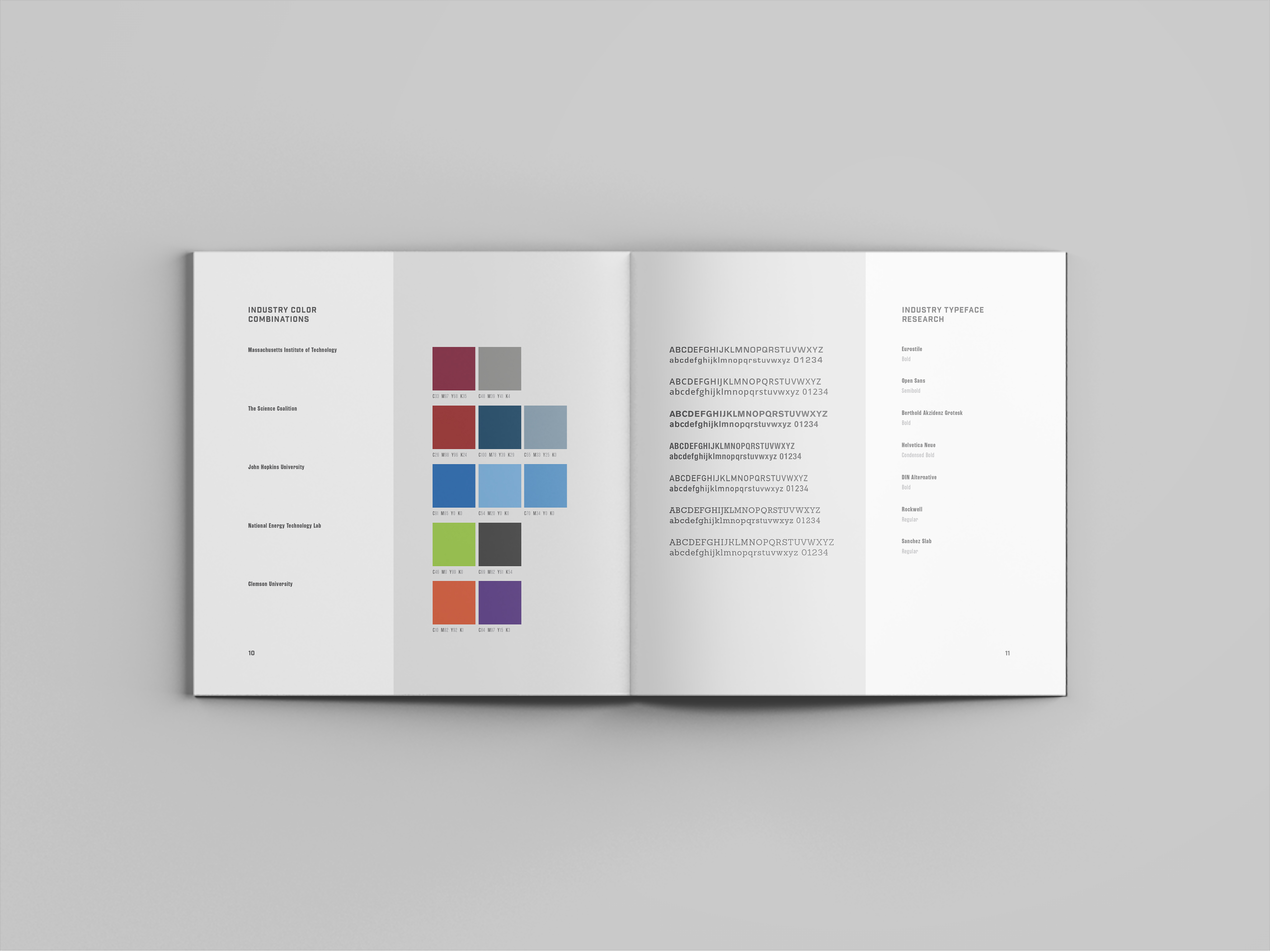
Upon deciding the industry that the brand would exist within, many companies with similar purposes were analyzed for their visual identities. This inspired the color and type selections for Quantum One.


Book
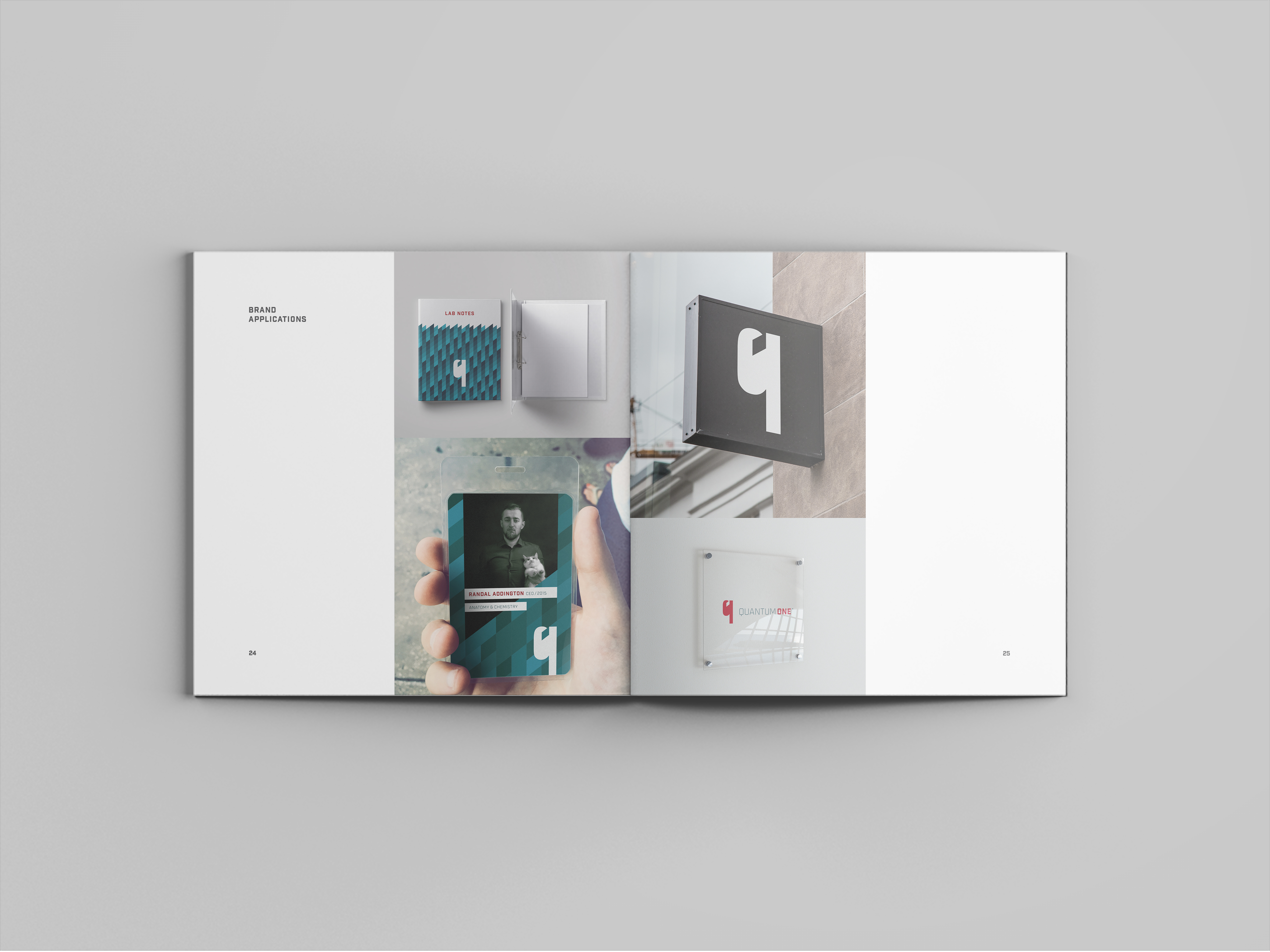
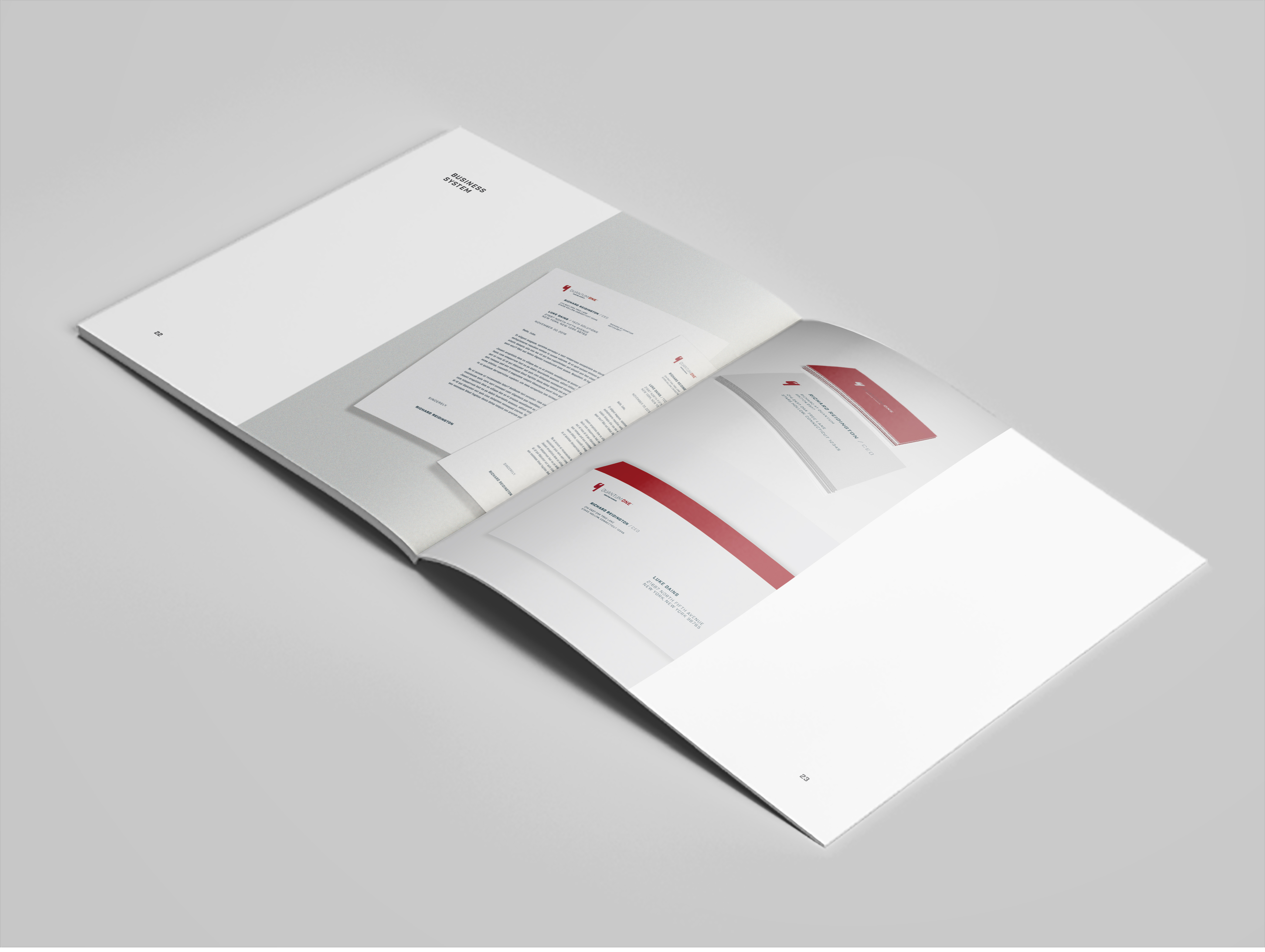
All sketches, research, brand development, and collateral were showcased in this booklet.
All sketches, research, brand development, and collateral were showcased in this booklet.
Other
Phoenix Design Week 2020Project type

Quantum OneBrand Identity
SwellephantProject type
EleviaProject type

Stash GearBrand Design

Studio Night PosterProject type

Social Media DesignSocial Media